Passing the DA-100 Exam - Study Notes
I recently passed Exam DA-100: Analyzing Data with Microsoft Power BI and earned Microsoft Certified: Data Analyst Associate. The DA-100 is the new role-based replacement for Exam 70-778: Analyzing and Visualizing Data with Microsoft Power BI which retires January 31, 2021. While much of the exam content overlaps, the skills measured has expanded and the weights adjusted. Luckily, Microsoft has done a really nice job with their free learning paths to prepare for the exam.
Preparation
The learning paths are listed at the bottom of the exam page. They walk through all the features and link to related Microsoft Docs pages for more information. In addition, they offer ‘sandbox’ labs to give hands-on practice for the topics. While not a replacement for working experience with Power BI, they are still an excellent way to work through the presented topics.
The following are notes I compiled during exam preparation. All notes are from the learning paths and related documentation. They are NOT comprehensive of everything on the exam, and shouldn’t be considered a replacement for preparation. I wanted to create a quick way to review the learning objectives the morning of the exam. To all pursuing the DA-100, I wish you the best of luck!

Get started with Microsoft data analytics
This learning path summarizes the types of analytics, related roles, and parts of the Power BI platform.
I. Discover data analysis
Analytics categories:
- Descriptive - what
- Diagnostic - why
- Predictive - trends, eg neural networks, decision trees, regression
- Prescriptive - how to hit target, eg machine learning on past data sets
- Cognitive - Draw inferences from data, and add the findings back to knowledge base for self-learning loop
Roles:
- Business analyst - closer to the business
- Data analyst - reporting specialist, manage reports, data sets, dashboards, etc. The exam is on Data Analyst! The DA tasks are the objectives of the exam
- Data engineer - data flow and integration
- Data scientist - extract value from data through analytics
- Database administrator - operational aspect of data platform
II. Get started building with Power BI
Power BI is:
- Power BI Desktop
- Power BI service
- Power BI mobile
Building blocks in Power BI:
- Visualizations - visual representation of data
- Datasets - collection of data
- Reports - collection of visualizations on one or more pages
- Dashboards - collection of visualizations form one page
- Tiles - single visualization
App - a collection of preset visuals, data, reports packaged to share
Prepare data for analysis
This learning path how to connect to various data sources and transform it.
I. Get data in Power BI
A variety of data source connectors built-in e.g. flat file, relation, NoSql, multi-dimensional, on-line
Storage modes:
- Import
- DirectQuery
- Dual (Composite)
Additional option for connecting to multidimensional i.e. Analysis Services is called Connect Live (formerly named Live Connect).
Both import and DirectQuery go through Power Query (Connect Live does NOT). Power Query can optimize source queries in some circumstances. The process is called query folding. Any transformation that has an anagalous SQL statement e.g WHERE, GROUP BY, SORT, UNION ALL, and JOIN can generally be folded.
Query Diagnostics is a tool new to me that is part of Power Query. Enable diagnostics, refresh the source(s), then stop the diagnostics. It presents information for each transformation step!
Optimization techniques:
- Process as much at source as possible
- For Direct Query, use native SQL and not stored procs or CTEs
- For Import from relational, don’t use embedded SQL as Power Query will NOT perform query folding
- Split date and time columns (this is really a data modeling optimization) as it increase compression (smaller memory footprint).
Power Query also has tools to view data quality, column distribution, and column profile.
Distinct values count makes sense. Unique values count sounds like the same thing, but its the number of values that only appear once.
Power Query examines the first 1000 rows by default. Change this by clicking the profiling status in the status bar and select ‘Column profiling based on entire data set’.
II. Clean, transform, and load data in Power BI
Append queries are like SQL UNION ALL.
Merge queries are like SQL JOIN (INNER, LEFT OUTER, FULL OUTER)
Model data in Power BI
I. Design a data model in Power BI
Date Table - can be imported from a DW (best), built in Power Query (great), built with DAX (good).
Power Query - = List.Dates(#date(2011,05,31), 365*10, #duration(1,0,0,0)) Then convert the List to Table, then add columns as needed. There are many built-in date conversions in the UI. Highlight the date column, Add Column -> Date (in the From Date & Time group).
DAX - CALENDAR or CALENDARAUTO, then add each column e.g. DayOfMonth, Year, etc. The table won’t compress quite as well, but date tables are small enough to have negligible difference.
Mark Table as Date Table. Dates must not duplicate, and not have gaps.
Best Practice - Turn off Auto DateTime, as it builds a hidden date table for each datetime column in the entire data model.
Composite models allow a combination of imported tables and DirectQuery tables. Relationships between imported and DirectQuery tables default to many-to-many, but can be changed. It defauls to many-to-many because it can’t detect nor assume uniqueness for the DirectQuery table.
Many-to-many relationships are now supported and can replace the tradtional bridge table method. The important bit to remember is to still use single-direction filter propogation. Marco Russo has a very good presentation on this.
Aggregations are a powerful feature for combining DirectQuery detail data with the performance of imported data. Aggregations import some higher grain of the detail data. A key supporting feature is Dual mode for related dimension tables. Dual mode imports the data for DAX queries against the aggregation, and treating the table as DirectQuery when relating to the detail data. This is a very important performance feature to understand.
More reading:
Data models support both hierarchis, display folders, and table/column hiding to better organize the columns used in analysis. Good model design = good UI design.
II. Introduction to creating measures using DAX in Power BI
Calculated columns are materialized at data refresh. They do not compress as well as imported columns, meaning they consume more memory.
A simple formula to demonstrate non-additive measure pattern:
Last Inventory Count =
CALCULATE (
    SUM ( 'Warehouse'[Inventory Count] ),
    LASTDATE ( 'Date'[Date] ))
Every time the measure is evaluated, it uses the latest date visible in the filter context.
Tables that only have measures visible (all columns hidden) are displayed at the top of the fields list with a different icon.
III. Optimize a model for performance in Power BI
A good data model in THE key to accurate numbers and good performance.
In general, reduce the size of the data model by:
- Removing unnecessary columns
- Remove unnecessary Date/Time hierarchies (turn off Auto date/time option)
- Reduce cardinality as much as possible. For example, use qty * price instead of a higher cardinality sales column
- Avoid calculated columns
- Use the star schema design pattern
- Push detail grain to DirectQuery and store higher-grain as aggregations
Read more: Data reduction techniques for Import modeling
Power BI Desktop has a Performance Analyzer to show time elapsed for each visual and the generated DAX. Be aware of the visual cache and the storage cache. To clear both:
- Create a new blank report page in Power BI Desktop.
- Close and re-open Power BI Desktop
- Start the Performance Analyzer (while still on the blank report page)
- Finally, open the report page to analyze
Direct Query does not support Quick Insights and Q&A in the Power BI service.
To minimize lag on visuals refreshing, you can reduce the number of queries using options called Query Reduction. This allows disabling automatic visual interaction, manually apply slicer interaction (via a button), options for applying filters (via buttons to apply as you go or apply all).
Read more about DirectQuery:
Aggregations can be used to improve query performance of DirectQuery. The aggregation table can either be in-memory or DirectQuery. Raed more on Aggregations: Use aggregations in Power BI Desktop.
Visualize data in Power BI
I. Work with Power BI visuals
Types of visuals:
Clustered vs stacked bar chart - clutered show the total while stacked shows the breakdown of the total.
Line vs area chart - area chart is just a line chart filled in.
Pie chart vs donut vs tree map - A donut chart is a pie chart with the middle missing for a label. A tree map is a square pie chart essentially.
Combo chart - combinds a bar chart and a line chart.
Card - single data point.
Funnel charts - Good for showing values for a sequential process e.g. sales lead conversion.
Gauge chart - progress towards a goal.
Waterfall/bridge chart - shows a running total as increases/decreases.
Scatter chart - good for analyzing a large set of data points over time.
Maps - requires the specific data sources to be categorized for use.
Slicer - For filtering data on other visuals.
Q&A - Allows natural language questions and answers. A good data model and adding meta data (synonyms) can improve this experience. QA has these components:
- The question box, for typing question (and shown suggestions)
- A pre-populated list of suggested questions
- An icon that users can select to convert the Q&A visual into a standard visual.
- An icon that users can select to open Q&A tooling, which allows designers to configure the underlying natural language engine.
Tooltips - Tooltips support data fields. Also, they support displaying a report (that has been registered as a tooltip).
Custom visuals - Can be imported from AppSource or Your Organizations gallery. Custom visuals must be imported each time you start developing a new report.
R/Python visual - Need to enable script visual and configure the runtime.
KPIs - Needs three items: 1) a goal, 2) a unit of measurement, and 3) a time-series.
II. Create a data-driven story with Power BI reports
Power BI desktop provides tools for aligning, resizing the report and the layout within in.
Accesibility features built-in:
- Keyboard navigation
- Screen-reader compatibility
- High contrast colors view
- Focus mode
- Show data table
Accesibility features to configure:
- Alt text
- Tab order
- Titles and labels
- Markers
- Themes
The following features work together:
- Bookmarks capture the state of a view of the report, allowing to quickly return/restore it.
- Selections allow you to enable/disable items from the bookmark. This is viewable in the slection pane.
- Buttons have actions, one of which is to display a bookmark.
Button: conditional formatting based on a measure can include the action.
Cross-report drill-through - Can be enabled/disabled in Power BI Deskop options and/or Power BI service. Allow a report to drill-through to a different report. Note: Navigation ‘Back’ button will be created automatically but should be deleted because it ‘Back’ only work within navigation within a report.
Conditional formatting has many Excel-like options like highlighting and color bars.
Slicers vs filters - slicers are additional DAX query to populate all values before selection (because it is a visual). Filters are not a visual and do not generate an additional DAX query.
Types of slicers:
- Numeric range slicers
- Relative date slicers
- Relative time slicers
- Responsive, resizable slicers
- Hierarchy slicers with multiple fields
More reading: Slicers
The filter pane allows:
- Show/hide the filter pane
- Show/hide specific filters
- Lock a specific filter i.e. not editable by the report consumer
- Filtering at visual, report, all report, or drill-through
Power BI service supports anayzing through Excel and exporting to CSV, Excel, and PDF.
The report editor lets you switch between regular and mobile design views. The mobile app serves up the mobile version of the report.
Sync slicer does just what is says – allows slicer value to stay synced across selected reports
III. Create dashboards in Power BI
Dashboards vs Reports
- Dashboards can be created from multiple datasets or reports.
- Dashboards do not have the Filter, Visualization, and Fields panes that are in Power BI Desktop, meaning - that you can’t add new filters and slicers, and you can’t make edits.
- Dashboards can only be a single page, whereas reports can be multiple pages.
- You can’t see the underlying dataset directly in a dashboard, while you can see the dataset in a report - under the Data tab in Power BI Desktop.
- Both dashboards and reports can be refreshed to show the latest data.
Besides pinning tiles to dashbords, tiles can be created on the dashboard of text boxes, images, videos, streaming data, and web content.
Dashboards support pinned reports named “Live Page” because as the data is refreshed, so will the tile in the dashboard. You can also interact with them, unlike other tiles.
Dashoards support themes, both out-of-the-box themes and custom themes authored as JSON.
Question in Learning Path I got wrong - In both reports and dashboards, you can use the slicers and filter by selecting a data point. Hmmm.
Data alerts are only in the power BI service for certain visuals: KPI visuals, gauges, and cards. Alerts will show an alert icon over the tile (though sometimes the browser cache requires F5 reload) and an optional email.
Report users can configure their own set of alerts.
Q&A - Natural-language interface for the data. Three main components:
- Question box
- Pre-populated suggestion tiles
- Pin visual icon
Real-time data is supported through streaming datasets. These are stored in cache and do not support data modeling. Tiles on a dashboard are bound directly to the streaming dataset.
Read more: Real-time streaming in Power BI
Data clasification - a way to tag reports as informational awareness ONLY; no actual security is enforced by the Power BI service.
Phone view in the dashboard is customizable for each user.
When pinning visuals to a dashboard, they retain whatever filter context is selected. Tip: Use relative date slicers e.g. Current Week, Current Month, etc.
IV. Create paginated reports
Paginated reports are basically SSRS, and only for Premium Capacity (or the new Premium-per-user license). Best use: Operational reports and tabular formatted data.
Not built in Power BI Desktop or the service; built with Power BI Report Builder, basically a newer version of the SSRS Report Builder app.
Paginated reports can connect to Power BI datasets. It uses the MDX editor, not the SQL editor in those cases.
Data analysis in Power BI
I. Perform analytics in Power BI
Power BI has several tools for advanced analytics:
- Groups - manually group attributes.
- Bins - create bins on numeric data.
- Clustering - an option on scatter chart visual (any others?) to color clusters of points using statistical analysis
- Time-series analysis - Scatter chart has a play axis visual to animate data changing over time
- Analyze feature - On visuals, the analyze feature can explain increase/decreas or why a distribution is different. Read more about Analyze
- Quick Insights - Machine-learning algoriths run on the data set (Power BI service only; imported datasets only). The insights results cards let you drill-down more with scoped insights.
- AI Insights - Text Analytics, Vision, and Azure Machine Learning. Text and vision require Premium Capacity license.
II. Work with AI visuals in Power BI
The Q&A feature is part of both the Power BI service and Power BI Desktop! Q&A is meta-data driven. Q&A will underline unrecognized words with a squiggly red line. Some metadata is derived, but Q&A setup lets you:
- Review question - see all questions asked
- Teach Q&A - an easy way to define unknown terms
- Manage terms - Review/edit/add/delete terms
Q&A is displayed above dashboards automatically. You can also add a Q&A visual or a Q&A button to a report in Power BI desktop.
Key influencers - a visual that illustrates the factors affecting a metric
Decomposition trees - a visual that will automatically breakdown/drill-down measures. Selecting the AI ‘high value’ or ‘low value’ option will determine the most relevant combinations for each.
AI splits consider all available fields and determine which one to drill into to get the highest/lowest value of the measure analyzed.
Manage workspaces and datasets in Power BI
Create and manage workspaces in Power BI
Workspaces are centralized repositories of reports, dashboards, and datasets that offer collaboration and security.
Workspace built-in roles:
- Admin
- Publish/edit/delete content
- Add/remove users
- Publish/edit/delete app (bundled content)
- Schedule data refreshes
- Member
- Publish/edit/delete content
- Publish/edit/delete app (bundled content)
- Schedule data refreshes
- Cannot add/remove users, delete workspace, or edit workspace metadata
- Contributor
- Publish/edit/delete content
- Schedule data refreshes
- Viewer
- View reports/dashboards
- Read dataflow data
If the workspace is backed by a Premium capacity, a non-Pro user can view content within the workspace under the Viewer role.
The following are assignable to roles:
- individual users
- mail-enabled security groups
- distribution lists
- Microsoft 365 groups
- regular security groups (AD, I assume)
App - a published, read-only window into your data for mass distribution and viewing. Apps require Pro license to create AND view. As noted above, if backed by Premium Capacity, then Pro license for creating/publish, not for consumption.
App permissions include:
- Build - allow consumers to build new content from the app datasets
- Copy - copy the app into another workspace.
- Share - Allow to share with others
After publishing the app, you can edit the app in the workspace, but changes are not published until the ‘Update app’ action
Usage and performance metrics are only for Pro license, and roles admin, member, or contributor. They include variations on views and time to open.
Premium Capacity has deployment pipelines where workspaces can have development, test, and production designations. Dev has ‘Deploy to Test’ option. Test allows creating testing rules and ‘Deploy to Prod’ option. Test and prod give the option of replacing the data source (so that prod can point to a prod datasource, for example).
Read more: Deployment Pipeline Best Practices
The data lineage view illustrates datset to report to dashboard dependecies. The dataset card also display last refresh date, and offer a manual refresh option. The card also has an impact analysis option, which can show cross-workspace dependencies.
Data protection features:
- Sensitivity lables - built-in (None, Personal, General, Confidential, and Highly confidential) and also custom labels supported (through Microsoft 365 security center). Can be assigned to content. Does not prevent export, but exports the label for supporting applications (PDF, Excel, PowerPoint).
Not on exam, but Power BI supports both classic and new workspaces. Read more: New Workspaces
Manage datasets in Power BI
Data sources support parameters, defined in Power Query editor. Even the data source connection string/properties can be parameterized. Parameter values can be pre-defined, or come from another query.
What-if parameters - enable running scenarios by generating a sequence of values (start, end, and increment defined by report author). Then create a new ‘forecast’ measure that uses the parameter with a defined measure (typically multiply). On the report, the value of the What-If parameter can be changed via a slicer. All this could be done manually, but the What-If parameter functionality streamlines the process.
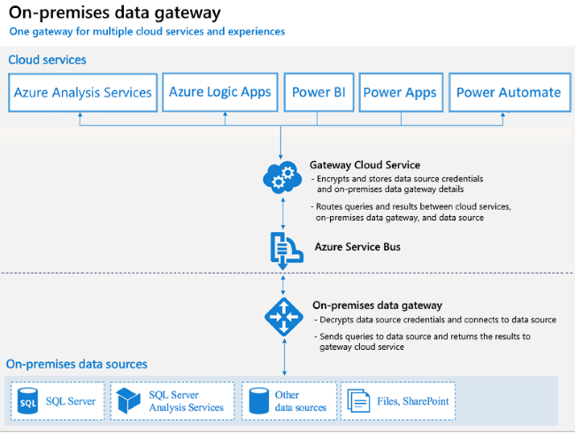
Power BI gateway - Oragnizational and Personal modes. Installed on on-prem server or workstation. Actually named On-Prem Gateway, and the same tool supports many Microsoft cloud integration tools.
Scheduled refresh - 8 per day, or 48 per day on Premium Capacity. The schedule disables after four consectutive refresh failures.
Incremental refresh - a simplified way for partition refresh (the traditional incremental refresh tactic). The date source MUST support query folding. The steps:
- Define the filter parameters (must be named RangeStart and RangeEnd)
- Use the parameters to apply a filter (in Power Query, greater than or equal to RangeStart and less than RangeEnd)
- Define the incremental refresh policy (on the table in the dataset, define rows to keep and rows to refresh. Power BI figures out the actual partition logic)
- Publish changes to Power BI service.
Endorsement - badge icons on datasets for confidence and clarity
- Promoted - any role but Viewer
- Certified - request certification/endorsement. Power BI admin can define who can certify.
Query caching (Premium Capacity only) - cache is specific to a user and report page.
Implement row-level security
Row-level security (RLS) uses a DAX filter as the core logic mechanism. The RLS can be static or dynamic. The roles (and RLS) can be tested in Power BI Desktop or Power BI service via ‘View As Role’ functionality. The steps are similar in both:
- Define a role
- Add a DAX expression to limit table(s)
- Add users to role
Static - Hard-coded value e.g. [department] = ‘game’
Dynamic - Uses userprincipalname() function that differs per user e.g. [emailAddress] = userprincipalname()


